Lowe’s · 2025 · Enterprise Commerce
Designing a scalable sample commerce platform.
Transforming fragmented category experiences into a unified sample journey across Lowes.com - from flooring and blinds to cabinets, countertops and beyond.
Role
Senior Product Designer
Ownership
End-to-end product design
Duration
3 weeks · discovery + design
Team
1 PM · 4 Web · 4 Mobile Engineers
01 - Business context
A category-by-category commerce empire, held together by inconsistency.
Lowe’s sells thousands of considered-purchase products - flooring, blinds, cabinets, countertops, siding - where customers rarely convert on the first visit. They order a physical sample first, then buy.
Every category had grown its own sample experience over the years. Different entry points, different rules, different visual languages. What looked like six product decisions was actually one absent platform decision.
02 - Business opportunity
Samples aren’t a feature. They’re the top of the funnel for a $9B category.
6+
Product categories operating on independent sample flows.
1 SKU
An ordered sample is the strongest intent signal short of purchase.
↑ AOV
Sample-to-purchase customers spend materially more than direct-to-cart shoppers.
The prize wasn’t redesigning a screen. It was building a shared capability - one sample commerce platform that any Lowe’s category could adopt, with room for the rules each category needs.
03 - The challenge
Why the existing experience failed.
Fragmented discovery
‘Order a sample’ appeared as a link on some PLPs, a modal on others, a hidden secondary CTA on the rest. Customers who wanted samples had to hunt.
Inconsistent interaction models
Some categories bundled samples into the PDP, others sent customers into a separate SKU flow. Same customer, three mental models in one session.
Missing between-category logic
A customer sampling blinds couldn’t also add a countertop sample without restarting. The system had no idea what a ‘sample cart’ was.
No post-purchase pathway
Once samples arrived, there was no bridge back - no reminder, no reorder, no way to convert a sample into the real, high-value purchase.


04 - Product vision
One sample commerce platform. Many category shapes.
Treat samples as a first-class commerce object - with their own discovery, their own cart, their own history - and let every category compose that platform to fit its business rules.
01
Discoverability by default
Every sample-eligible product surfaces a sample affordance in the same place, using the same words.
02
Consistent interaction model
One selection pattern. One cart pattern. One order pattern. Regardless of category.
03
Composable for category rules
Free vs paid, quantity caps, address gating, delivery windows - configuration, not redesign.
05 - Discovery & research
What changed my thinking.
Session replays, funnel analytics and store-associate interviews all pointed to the same behaviour: customers weren’t abandoning samples because they didn’t want them - they were abandoning because they couldn’t find or trust the flow.
Insight 01
Customers didn’t ask ‘how do I order a sample?’. They asked ‘can I see this in my home first?’ - a lower-friction ask that the current UI hid behind a shopping metaphor.
Insight 02
Trust was the real conversion driver. Address gating, delivery time and photo of the physical sample mattered more than price or upsell.
Insight 03
Categories weren’t different products. They were different rules on top of the same underlying object - a sample, a cart, an order.
06 - Experience architecture
Four surfaces, one system.
01
Discover
Sample entry points on PLP, PDP and category landing.
02
Select
Unified swatch and quantity picker with category-aware rules.
03
Cart
A dedicated sample cart that co-exists with the main cart.
04
Track & convert
Order history designed to close the loop back to the full-price purchase.
07 - Solution · Discoverability
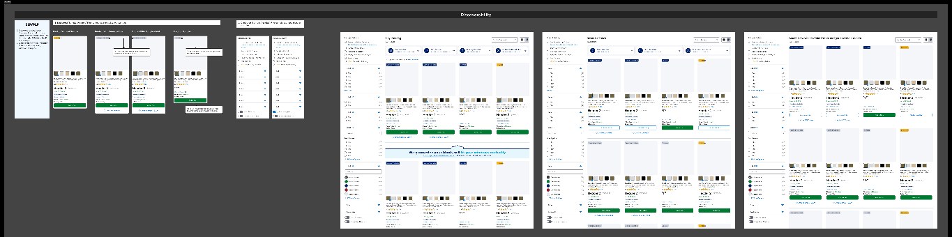
A sample surface that lives inside the product listing - not next to it.
The same PLP pattern, adapted to each category. Same eye path. Same swatch treatment. Same call-to-action. The customer’s muscle memory earns back all the interest we used to pay in fragmentation.
08 - Solution · Product detail
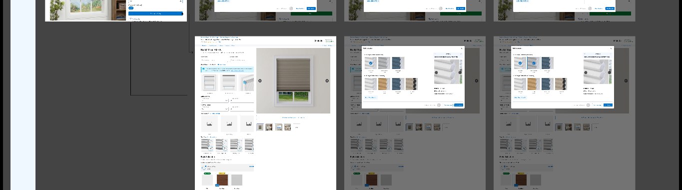
A configurator that scales with the category.
For a flooring plank the configurator asks for size. For a blind it asks for width, height, mount and control. Same component, different composition. Engineering builds it once; the platform composes it many times.
- · Sample selection isolated from the full-price CTA - no accidental orders
- · Address validation surfaced early, not at checkout
- · Progressive disclosure for optional configuration
09 - Solution · Sample cart
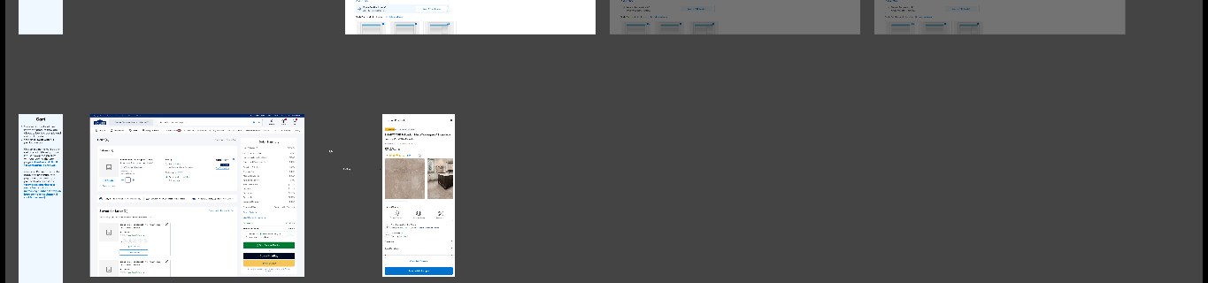
A cart that knows the difference between $9 and $9,000.
a
Isolation with escape hatches
Samples check out separately, but a persistent link moves customers back into the full-price cart when they’re ready.
b
Category rules, invisible to the customer
Free-with-address caps, paid overrides and delivery windows are handled by the platform, not by copy patches.
c
Mobile as the primary shape
Half of these journeys start on mobile - the cart is designed for one hand, not adapted from desktop.
10 - Solution · Order history
Closing the loop from sample to purchase.
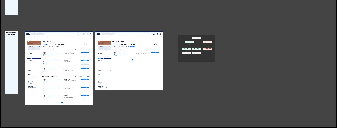
The sample is only valuable if it comes back as a decision. Order history is redesigned as a decision surface - every sample carries the path back to its full-price product, its measurement guide, and a schedule-a-measure entry point.
11 - Component thinking
Design system as the delivery vehicle.
The output wasn’t six screens. It was one sample-object model, one swatch component, one configurator scaffold, one sample-cart pattern and one sample-order module - each shipped into the existing Lowe’s design system with tokens, states and documentation.
That’s what made the case scale. New categories don’t brief a designer. They compose the platform, and I review the composition.
12 - Engineering collaboration
Designed for two build tracks in parallel.
Four web engineers and four mobile engineers picking up the work in parallel meant the design had to be legible without me in the room. Every component shipped with a state map, category-rule matrix and an accessibility spec.
Weekly design–engineering reviews caught mismatches before code. The three-week design window held because ambiguity was closed in the file, not in Slack.
13 - Business value
Strategic objectives the platform is built to move.
1 → many
Reusable capability across every considered-purchase category at Lowe’s.
Faster
New category sample launches move from design projects to platform configurations.
Higher intent
Sample-to-purchase pathway designed as a first-class funnel, not a side road.
Objectives as defined with product leadership. Post-launch measurement in progress.
14 - Reflection
What I’m carrying forward.
The clearest lesson: at enterprise scale, the design job is often to notice that six product problems are one platform problem. The value isn’t in the screens - it’s in the shared object model the screens sit on.
Next time, I’d invest earlier in a rules matrix with product leadership. Naming the differences between categories before designing the sameness saved weeks - I want that on day one, not day ten.
Next case study
Y Creator - UI showcase