Shadowfax Rider Super App · 2023
Rethinking Rider
Decisions
Helping delivery partners make better work decisions by redesigning the journey - not just the booking flow.
Role
- Senior Product Designer
Duration
- 4 Months
Team
- 2 Product Designers
- 2 Product Managers
- 2 Engineers
- Chief Product Officer
Responsibilities
- Product Strategy
- UX Research
- Interaction Design
- Product Design
- Usability Testing
- Cross-functional Leadership

The project started with a straightforward request:
“Can we redesign the Slot Booking page?”
Slot bookings were lower than expected and the assumption was simple - the booking experience needed improvement.
Before redesigning the page, I wanted to understand one thing:
Were riders struggling to book a slot, or were they never reaching the decision to book one in the first place?
That single question changed the direction of the project.
Instead of optimising a single feature, we uncovered a broader behavioural problem. Riders weren’t being guided towards the right decisions early in their journey.
The homepage surfaced information but failed to create clarity, confidence and urgency around earning opportunities.
The solution was no longer a better Slot Booking page. It became a redesign of the entire decision-making journey.
Impact
68%
Increase in Slot Booking Conversion
40–45%
Increase in Rider Earnings
100%
Rollout across the Shadowfax Rider App
↑
Improved Rider Supply Predictability
↑
Enterprise Delivery Demand Support
01 - Business Context
The ecosystem behind every slot.
Shadowfax operates one of India’s largest last-mile delivery networks, moving orders for enterprise partners across food, grocery and e-commerce. The rider app is the operational surface that connects three moving parts: enterprise demand, operational planning and rider supply.
Slot bookings sit at the intersection of all three. When a rider commits to a slot, operations can forecast supply, dispatch can promise SLAs to enterprises, and the rider gets a predictable earning window. When bookings drop, the entire chain gets softer.
Improving slot booking wasn’t a UI problem. It was a supply predictability problem for the business.
02 - The Challenge
The business believed Slot Booking was the problem.
The initial request was direct - redesign Slot Booking. Ship it faster, ship it cleaner, ship it soon. But the metric we were being asked to move wasn’t a design metric. It was a decision metric.
“Users can’t abandon a decision they never had enough confidence to make.”
03 - Reframing the Problem
Friction lived before Slot Booking.
Journey mapping revealed that by the time a rider landed on the Slot Booking screen, most of them had already decided not to book. The drop-off wasn’t inside the flow - it was upstream.
- Users lacked confidence in what a slot would earn.
- Users lacked context on where demand was actually happening.
- Users lacked visibility into which opportunities were worth their time.
Step
Open App
Low friction
Step
Scan Homepage
Friction
Step
Look for Demand
Friction
Step
Consider Booking
Actual drop-off
Step
Slot Booking
Low friction
04 - Research & Discovery
We stopped asking how to fix the screen. We started asking why the decision wasn’t being made.
01
Journey Mapping
Traced every touchpoint from app open to slot commit across 3 delivery verticals.
02
Rider Interviews
Long-form sessions with 18 riders across food, grocery and e-commerce.
03
Contextual Inquiry
Shadowed riders during live shifts to observe real decisions, not stated ones.
04
Competitive Benchmarking
Studied gig platforms globally to understand decision surfaces at scale.
05
Behaviour Analysis
Instrumented funnel data to see where confidence collapsed, not just where taps stopped.
06
Usability Testing
Prototype validation across new and experienced riders in three cities.
05 - Key Insights
What the data and the riders both said.
01
Riders were looking for confidence, not features.
Interface density wasn’t the issue. Certainty was. Riders wanted to know a slot was worth taking before they took it.
02
High-demand opportunities were difficult to discover.
Peak windows and hotspots existed in the data but were buried behind operational information the rider didn’t need.
03
Earning potential influenced behaviour more than operational information.
Estimated earnings changed decisions. Order counts and heatmaps did not.
04
New riders needed guidance. Experienced riders needed speed.
The same UI was punishing both groups - too sparse for one, too heavy for the other.
05
Users needed recommendations, not dashboards.
The homepage was answering ‘what is happening’ when riders were asking ‘what should I do next’.
06 - Design Principles
The four rules we designed against.
P1
Prioritise decisions over information.
Every element on the homepage should help the rider make their next move - not just report status.
P2
Surface opportunities before they are requested.
If the system knows demand is high nearby, the rider shouldn’t have to go looking for it.
P3
Reduce cognitive load.
Fewer competing signals. One clear default. Everything else earns its place.
P4
Build confidence through context.
Show why a slot matters, not just that it exists - earnings, distance, demand, timing.
07 - Opportunity Areas
Five levers, one shared goal.
Central goal
Confident
Rider Decisions
01
Help riders understand demand.
02
Reduce distance to action.
03
Replace static dashboards.
04
Increase earning visibility.
05
Support new and experienced riders.
08 - Design Exploration
Two ideations, each shaping the homepage around a different bet.
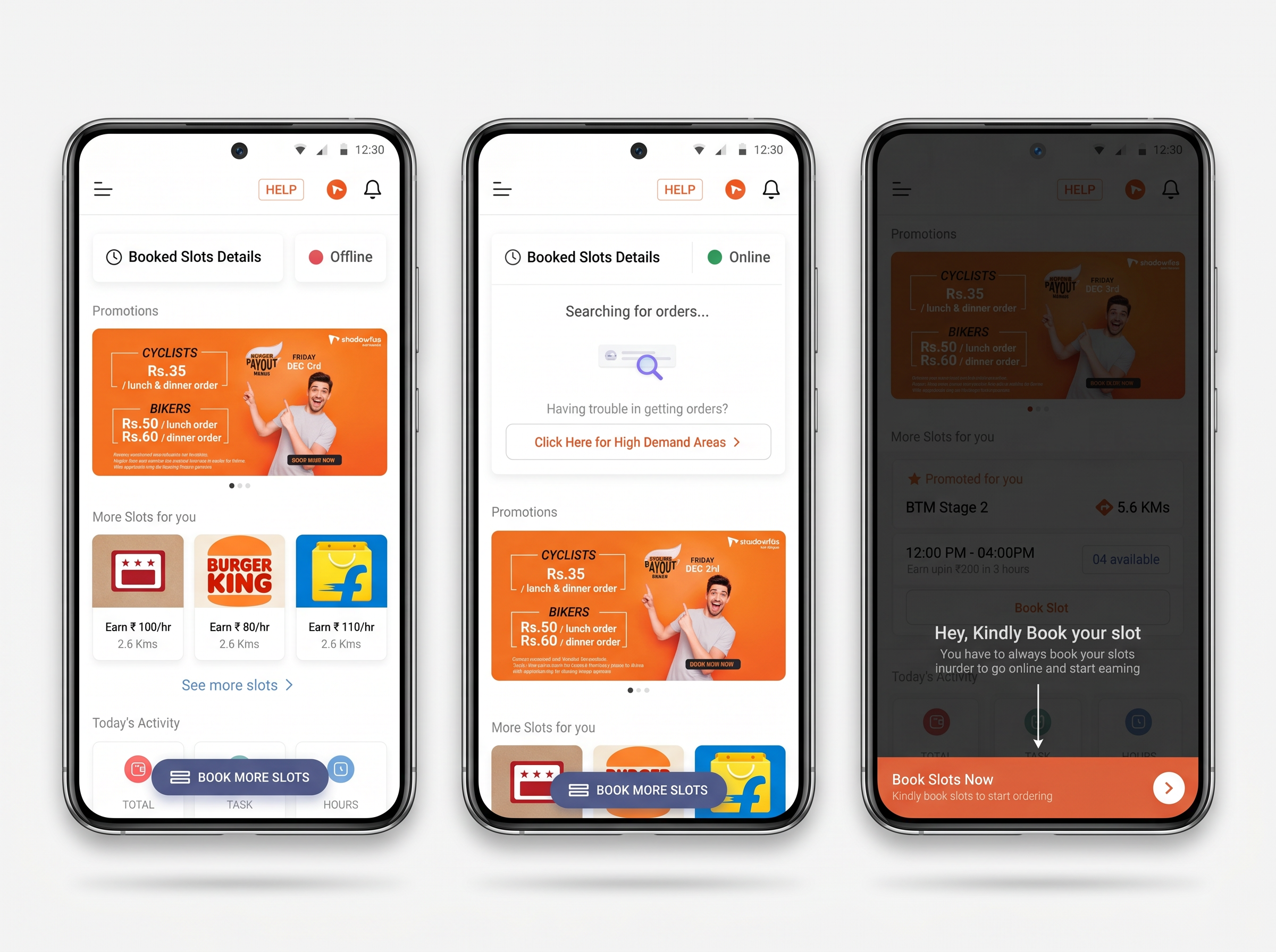
Concept A
Initial Design Ideations 01
Primary design decisions
- Provide Contextual Guidance
- We blacked out the entire screen and provided toast messages to guide our user towards necessary actions.
- Consistent Book Slot Bottom Bar
- We introduced a consistent bottom bar as a primary CTA in the homepage to drive more slot booking.
- Rearranged the Sections
- Sections that are unnecessary in a user journey are removed to avoid visual clutter & cognitive overload.
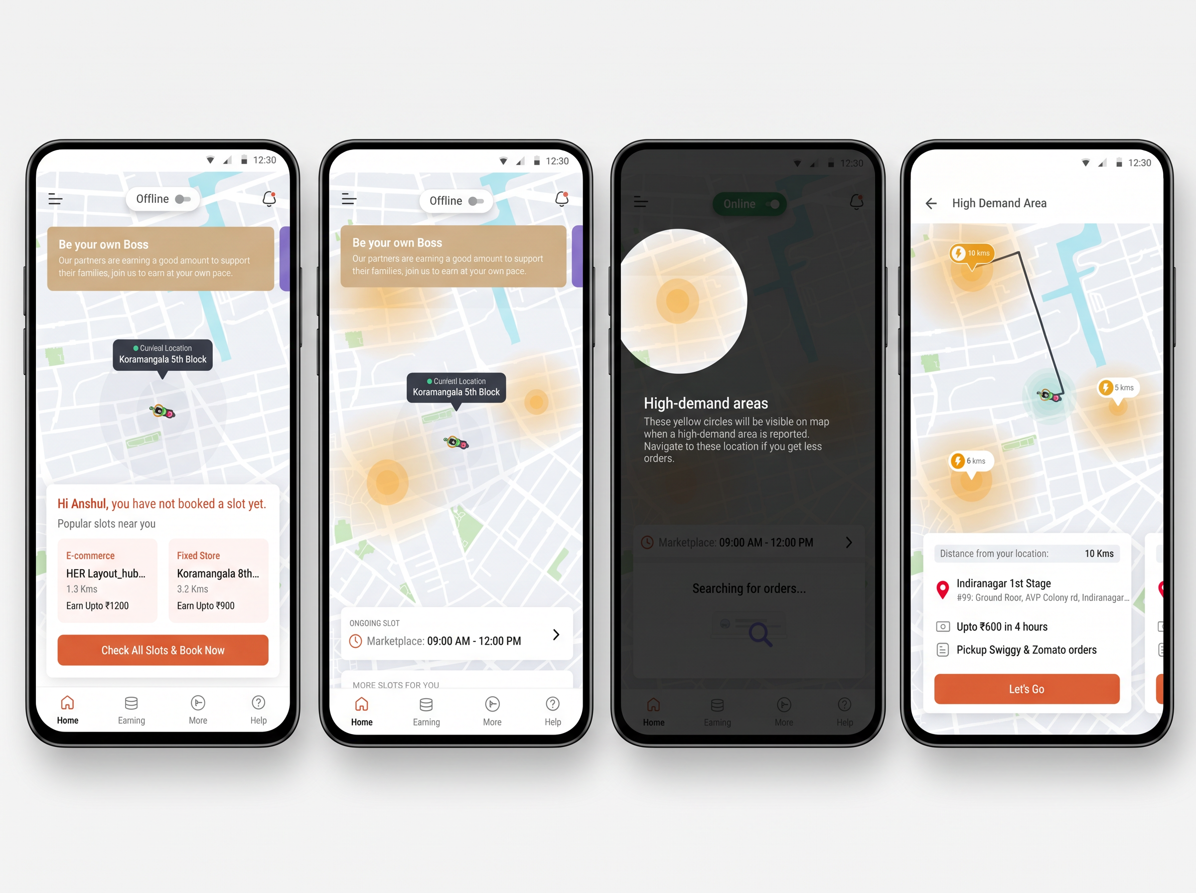
Concept B
Initial Design Ideations 02
Primary design decisions
- In App Map
- We used a map to showcase high demand areas and information that guides riders towards zones with high order volume.
- Contextual Card
- The bottom card at zero scroll state is kept dynamic — the task and actions change according to our rider’s order journey.
- New Information Architecture
- We redid the IA here to make the homepage more intuitive and explanatory.
09 - The Turning Point
The homepage shouldn’t function as a dashboard.
It should function as a decision engine.
10 - Final Experience
Every screen answers three questions.
What problem existed? What decision was made? Why it matters. If a screen couldn’t answer all three, it didn’t ship.
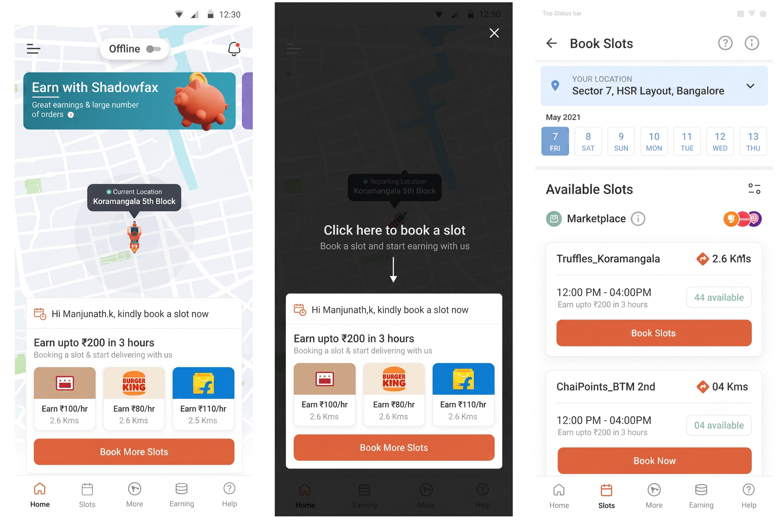
Screen 01
Homepage
- Problem
- The old homepage surfaced information but never guided the next action.
- Decision
- Reframed the homepage as a decision workspace with one recommended action at the top.
- Why it matters
- New riders got a clear starting move. Experienced riders got faster access to what they already wanted.
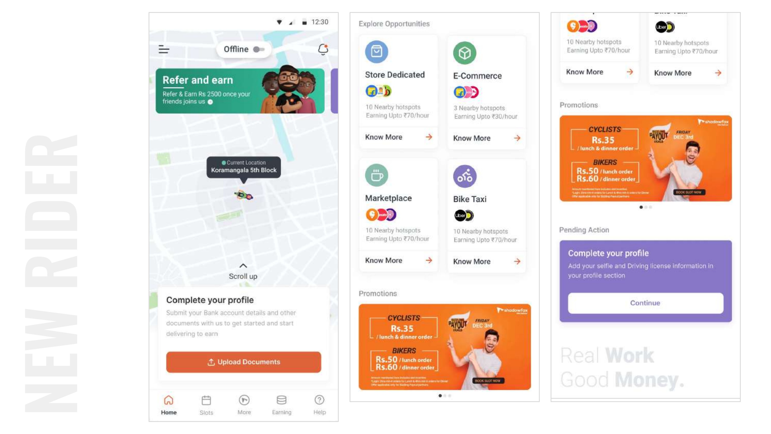
Screen 02
Demand Discovery
- Problem
- Riders couldn’t see where demand was, only that it existed somewhere.
- Decision
- Introduced a spatial + temporal view of demand tuned to the rider’s current zone and time of day.
- Why it matters
- Discovery moved from abstract to actionable - riders could see the next hour, not the next week.
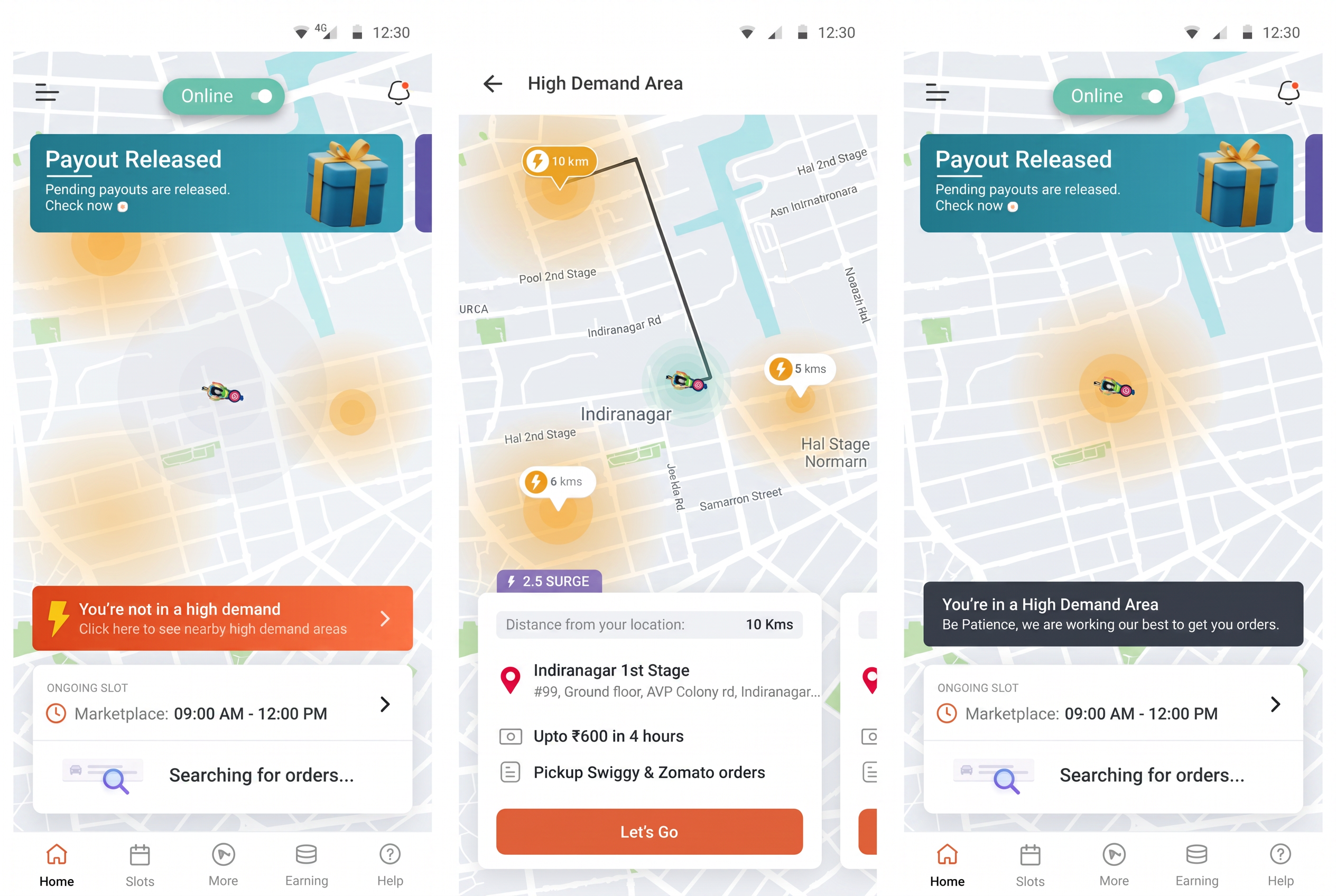
Screen 03
High-Demand Areas
- Problem
- Hotspots existed in data but weren’t reaching the rider in time to act on them.
- Decision
- Elevated live hotspots as first-class recommendations with earning context, not just a heatmap.
- Why it matters
- Directly ties supply to demand at the moment demand is spiking.
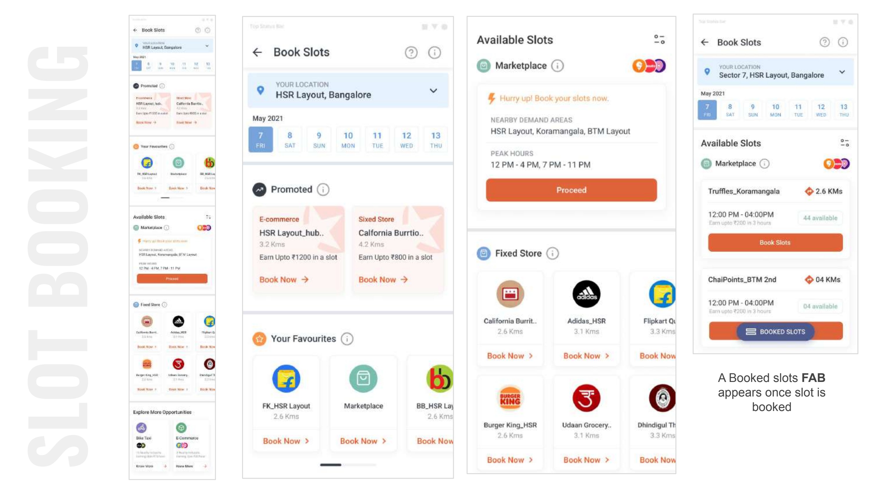
Screen 04
Slot Booking
- Problem
- The original request. Bookings were low because riders never reached confidence to commit.
- Decision
- Made slot booking impossible to miss and paired each slot with expected earnings and demand context.
- Why it matters
- Slot booking stopped being a screen and became a natural next step in a guided journey.
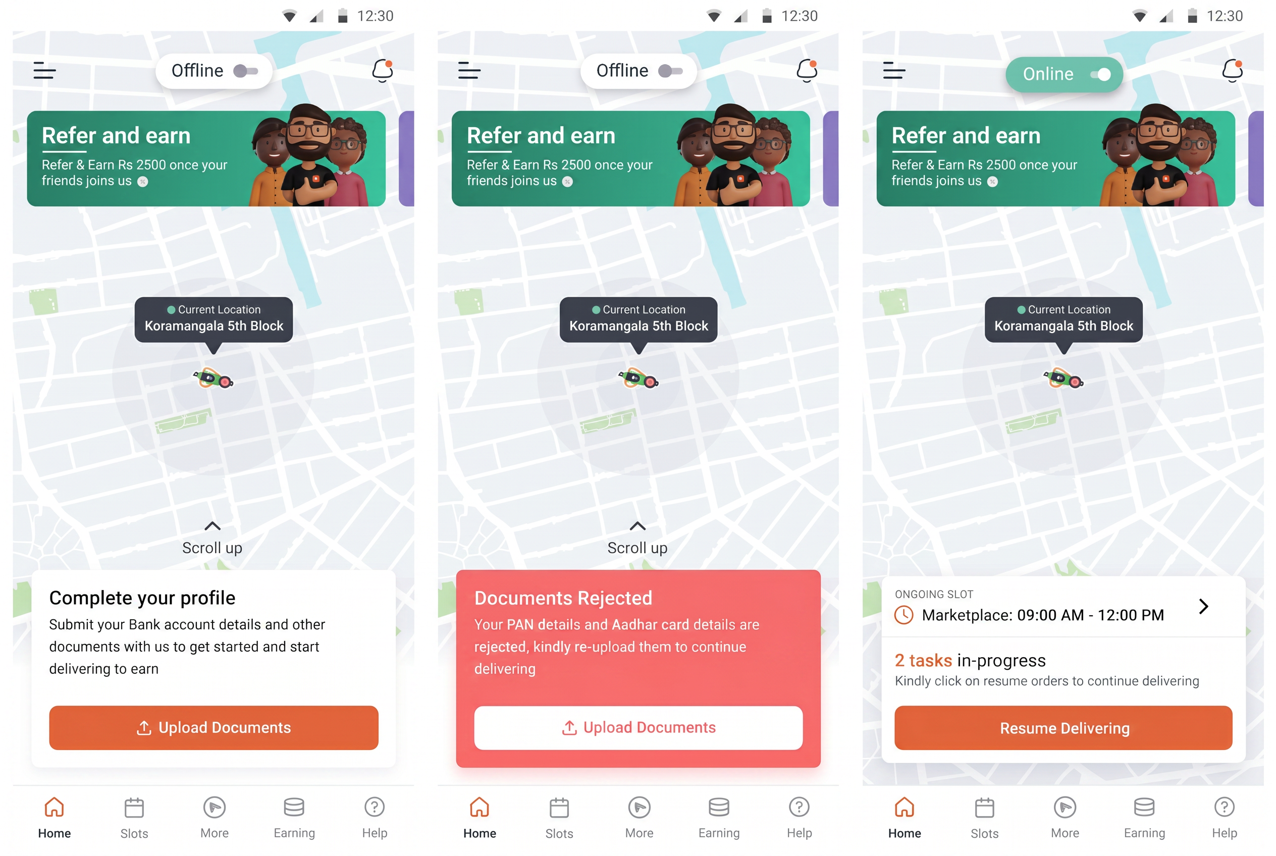
Screen 05
Task Recommendations
- Problem
- Riders had to think about what to do next after finishing a task.
- Decision
- Introduced a lightweight recommendation surface that suggests the next best move contextually.
- Why it matters
- Reduced idle time between deliveries - directly compounds daily earnings.
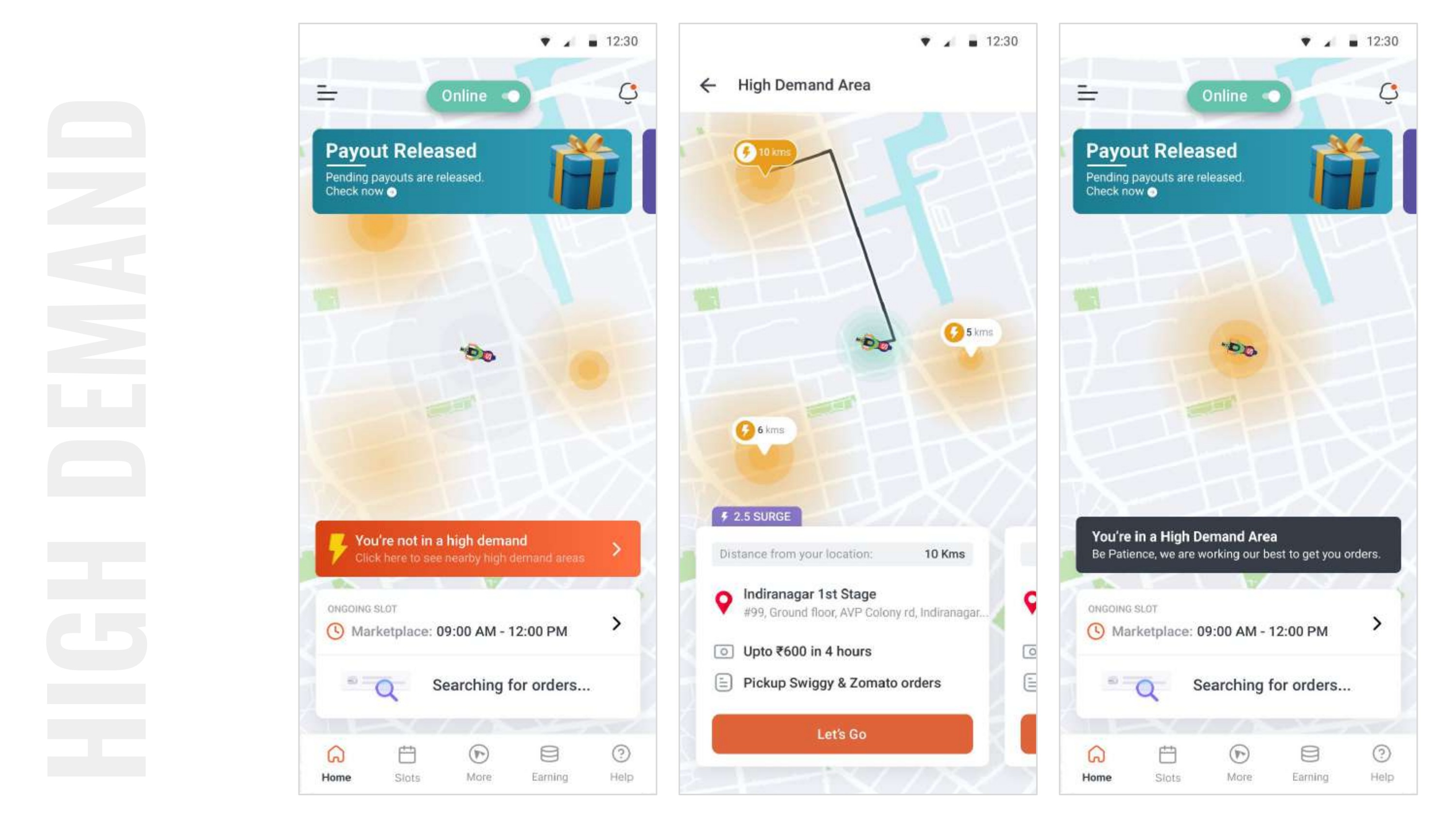
Screen 06
Earning Opportunities
- Problem
- Earning potential was invisible until after a rider committed.
- Decision
- Moved earnings context upstream - visible before decision, not after.
- Why it matters
- Turns earnings from a lagging indicator into a leading one for the rider.
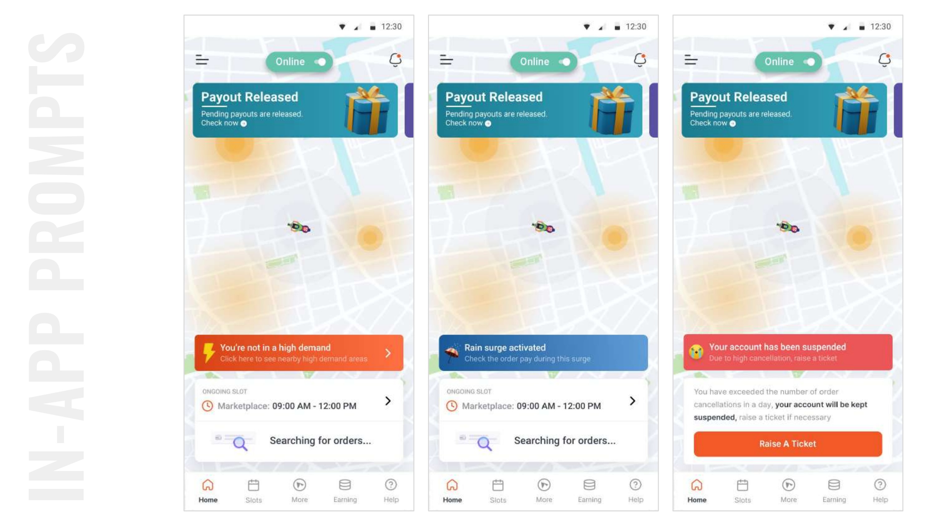
Screen 07
Contextual Guidance
- Problem
- Static tips didn’t adapt to what the rider was actually doing.
- Decision
- Replaced static content with contextual nudges tied to time, location and rider maturity.
- Why it matters
- Guidance became relevant, not noise - increasing trust in the system.
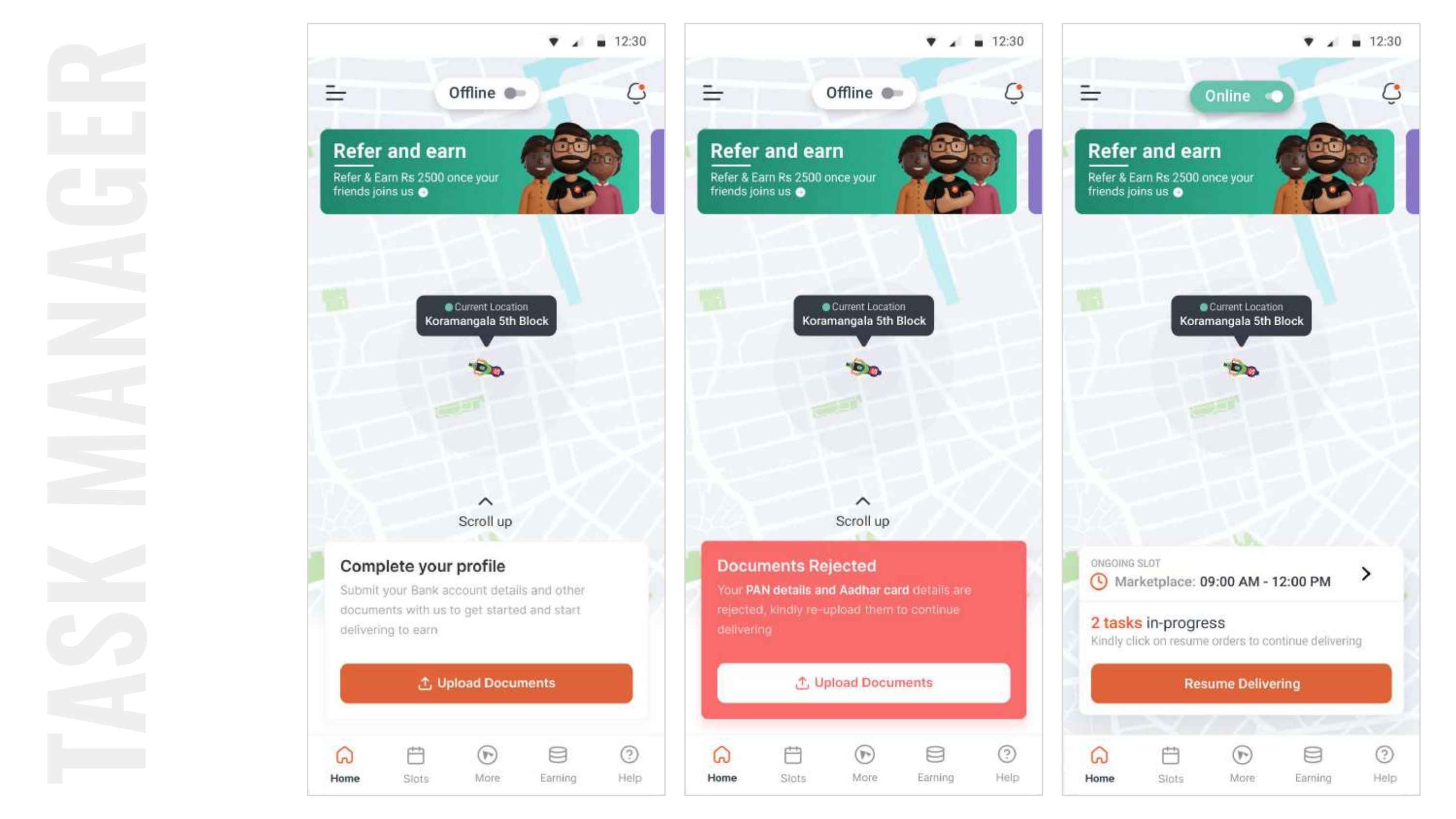
Screen 08
Onboarding Support
- Problem
- New riders were dropped into the same UI as experienced ones and often stalled.
- Decision
- Layered onboarding cues into the same homepage rather than a separate flow.
- Why it matters
- New riders reached first slot booking meaningfully faster without slowing power users.
11 - Major Product Decisions
Five trade-offs I would defend.
01
Turn the homepage into a decision workspace.
- Problem
- The homepage was a status screen, not a starting point.
- Decision
- Rebuilt it around a single recommended action with contextual depth beneath.
- Reasoning
- Riders open the app to act, not to read.
- Outcome
- Time-to-first-action dropped meaningfully across new and returning riders.
- Behavioural principle
- Prioritise decisions over information.
02
Make opportunity visible before commitment.
- Problem
- Earnings and demand were revealed only after a rider committed.
- Decision
- Moved earning and demand context upstream, into the recommendation itself.
- Reasoning
- Confidence has to exist before commitment, not after.
- Outcome
- Booking conversion increased 68%.
- Behavioural principle
- Build confidence through context.
03
Make Slot Booking impossible to miss.
- Problem
- The most valuable action was buried in an operational list.
- Decision
- Anchored slot booking at the top of the decision surface with earning-led framing.
- Reasoning
- The primary business action should also be the primary rider action.
- Outcome
- Rider supply predictability improved measurably for operations.
- Behavioural principle
- Reduce cognitive load.
04
Replace static information with contextual guidance.
- Problem
- Static tips and dashboards didn’t adapt to what riders were doing.
- Decision
- Introduced a lightweight rules layer that reshapes the homepage by time, zone and rider maturity.
- Reasoning
- Relevance is what turns information into guidance.
- Outcome
- Riders reported the app ‘knew what they needed’ - a qualitative signal that moved trust.
- Behavioural principle
- Surface opportunities before they are requested.
05
Support new riders without slowing experienced ones.
- Problem
- One UI was punishing both cohorts.
- Decision
- Layered onboarding cues into the same surface rather than forking flows.
- Reasoning
- Two apps means two maintenance costs and two disjointed experiences.
- Outcome
- New riders activated faster while power users kept their speed.
- Behavioural principle
- Design for progression, not for personas.
12 - Validation
18 riders. Three verticals. Every assumption on the table.
We tested with 18 rider participants across food delivery, grocery delivery and e-commerce delivery. Testing wasn’t a final gate - it was where several of our early assumptions got broken and rebuilt.
What was tested
- Homepage recommendation hierarchy
- Slot booking earning context
- Demand discovery patterns
- Onboarding overlay behaviour
What changed after testing
- Earning context moved higher in the card
- Recommendation copy shifted from operational to outcome-led
- Onboarding cues became dismissible per module
Assumptions we got wrong
- “Riders will read the map.” - They didn’t.
- “Experienced riders want less UI.” - They wanted faster UI.
- “Earning estimates feel risky.” - They built trust when shown honestly.
- 01V1 - Recommendation-led homepage
- 02V2 - Earning context surfaced upstream
- 03V3 - Onboarding cues layered in-place
- 04V4 - Shipped to production
13 - What Changed After Testing
Before and after, honestly.
Before
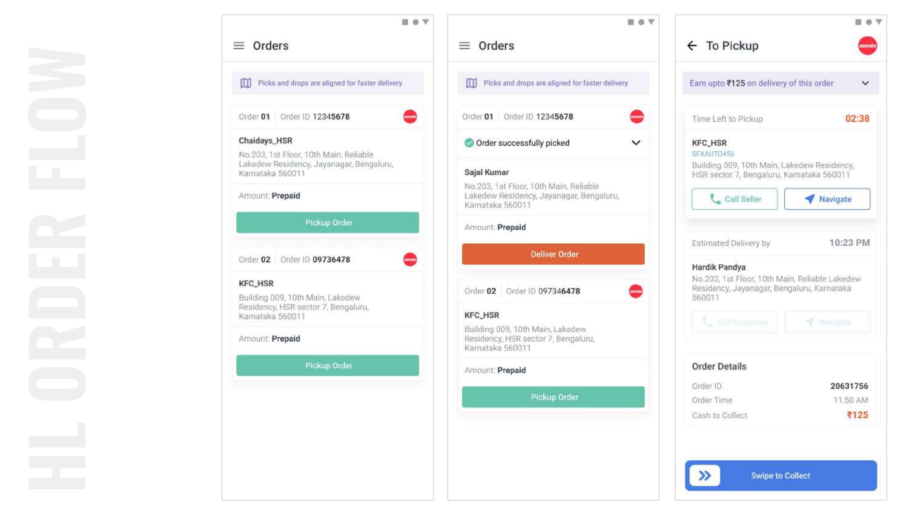
- Homepage read like a dashboard.
- Slot booking sat inside a list.
- Earnings visible only after commit.
- One UI for every rider.
After
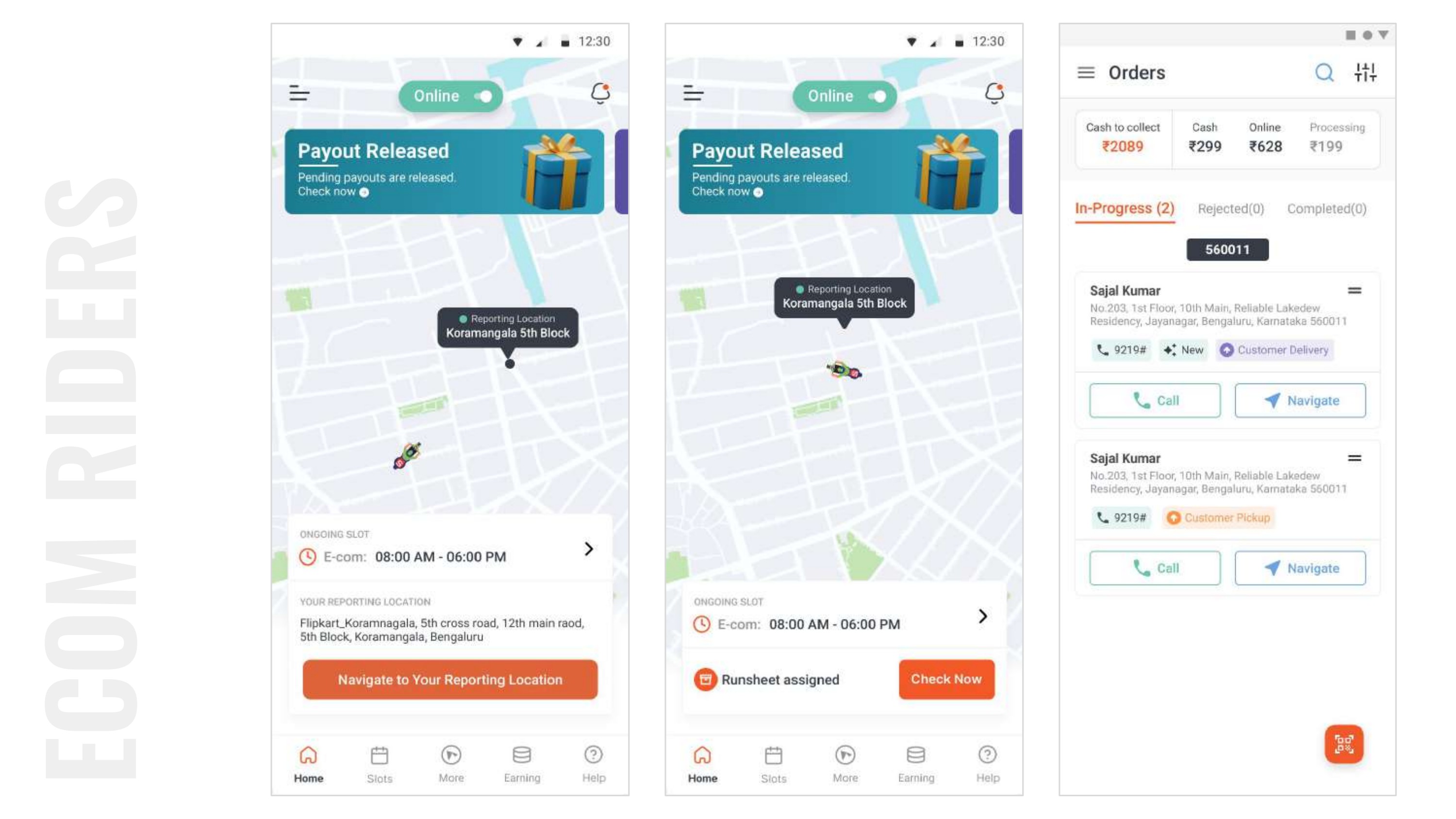
- Homepage reads like a decision.
- Slot booking is the primary action.
- Earnings visible before commit.
- One UI that adapts to the rider.
14 - Collaboration
Aligning a business behind a bigger problem.
The hardest part of this project wasn’t the design - it was convincing the business that a request to redesign one screen was actually a request to redesign a decision journey.
I worked closely with Product Managers to reframe the metric we were optimising for, with Engineering to sequence the work so we could ship the homepage without blocking downstream releases, and with the CPO to secure air-cover for a broader scope than originally briefed.
- 01Initial RequestWeek 1
- 02Challenge AssumptionWeek 2
- 03ResearchWeek 4
- 04Root Cause DiscoveryWeek 6
- 05Stakeholder AlignmentWeek 8
- 06Homepage RedesignWeek 10
- 07ValidationWeek 12
- 08RolloutWeek 14
- 09ImpactPost-launch
15 - Business Impact
Outcomes that mattered to the business, not just the interface.
68%
Increase in Slot Booking conversion
40–45%
Increase in rider earnings
↑
Visibility of high-demand zones
↑
Rider supply predictability
↑
Enterprise delivery demand support
0→1
Homepage adopted as the new default surface
16 - Reflection
The biggest lesson wasn’t how to redesign a homepage. It was learning that product teams often solve the symptom instead of the cause.
The most impactful design decision wasn’t creating a new interface. It was challenging the original problem statement - and having the evidence, the alignment and the patience to hold that new framing long enough for the team to design against it.
17 - Key Takeaways
01
Challenge assumptions.
The briefed problem is rarely the real one. Reframing early saves quarters later.
02
Design for decisions.
Interfaces don’t just display state - they shape the choices users make.
03
Measure impact beyond screens.
Design impact is a business number, not a screenshot. Instrument accordingly.